Showing posts with label Research and Planning. Show all posts
Showing posts with label Research and Planning. Show all posts
Tuesday, 5 March 2013

Sunday, 3 March 2013
Friday, 1 March 2013
Wednesday, 13 February 2013
Magazine front cover & Film Poster 2nd draft

However, their are many essential aspects of the film poster which this draft lacks or doesn't have. Firstly, the general font and typography of the poster(excluding the credit blocks at the bottom) have the same kind of font. Additionally, there is a lot of dead space on the page, which doesn't make the poster really appealing. Furthermore, there is no release date on the page, so any onlooker whom were interested in the poster would not have any further information than the title. slogan and credit blocks. A particular grievance was the mask on the poster. This mask is iconic for being the mask of the protagonist in the 2005 thriller film V for Vendetta, so any association for the target audience would be with this film, not anyone from my poster. I need to particularly change the mask of the poster so my target audience won't associate with another film and demote any appeal to my trailer, magazine or poster.

My magazine front cover second draft was praised by my teacher for the overlapping effect of the masthead, as well as the blur effect of the blade in the main image- which supports the generic representation of a slasher horror genre. An issue that I need to build on is my font. Similarly to my poster draft, my font type was the same all over the page, and a generic magazine covers have at least two or three font types. Similarly, the main image of the masked figure holding a knife is blurred- which has a good effect on the knife motioned like it will cut the page- however the quality of the general image is decreased.
Monday, 28 January 2013
Film Screenplay
SHOT ONE
SHOT FOURTEEN
Long shot, tracking shot. Feyi walks into the school atrium
and exits to the staircase.
SHOT TWO
Mid Close up. Match cut.
Feyi enters first floor balcony, gradual zoom on his face as he catches
sight of Mo, Tanvir and Maisie.
SHOT THREE
Match cut, long take. Maisie, Tanvir and Mo see Feyi; close
up shot of their menacing looks at Feyi. Mohammed shouts ‘WHAT YOU LOOKING AT?’
Maisie, Tanvir and Mo laugh as Feyi walks past with his head down, walking
quickly past them scared. Tanvir laughs,
says ‘look at his face’
Fade to next shot
SHOT FOUR
Tracking shot. Feyi goes to his locker, cornered by Mohammed,
Maisie and Tanvir. Mohammed says ‘I asked you a QUESTION!’, pushes him against
the wall. Feyi stays silent. Maisie pushes Feyi, says ‘YOU’RE ASKING FOR A
BEATING!!!’ Tanvir motions to get
something out of his pocket. Close up, over the shoulder shot of Feyi asking,
‘IS THAT WHAT I THINK IT IS?’
SHOT FIVE
Over the shoulder shot.
Mo, Maisie and Tanvir surround Feyi in the corner. Sound of a crack.
Fade out
SHOT SIX
Low angle. Close up. Slow Pan of Feyi, Mo and Maisie faces
looking down at Feyi’s body.
SHOT SEVEN
Low angle tracking shot of Feyi’s lifeless body being
dragged away. Close up of Tanvir saying
‘NO ONE HAS TO KNOW.. .’
SHOT EIGHT
Over the shoulder shot.
Mo, Tanvir and Maisie later walking in the atrium.
Figure resembling Feyi in his hoodie watching them on the
first floor balcony.
SHOT NINE
Match cut, eye level. Maisie turns around; no one is on the
balcony. Tanvir asks, ‘what’s wrong?’
Mo says, ‘you’re seeing things…Feyi’s not there’
SHOT TEN
Maisie, Tanvir and Mo walking up the stairs. Hooded figure following them loosely. Close up
over the shoulder shot of Feyi walking up the stairs slowly.
Mo turns around;
shouts ‘WHO’S THERE? WHO MESSING ABOUT?!!!’
SHOT ELEVEN
Close up shot of Maisie Screaming. Tanvir and Mo, turn
around to see she’s not there.
SHOT TWELVE
Tanvir and Mo come out of the staircase; Tanvir sees Feyi
standing behind him in the mirror.
SHOT THIRTEEN
Match cut. No ones,
there when Tanvir turns around.
Over the shoulder shot of Tanvir walking quickly down, Shouts
‘MO, WHERE ARE YOU?’ someone is following him. Runs off into the staircase
SHOT FOURTEEN
Maisie, Tanvir and Mo meet in the Assembly Hall. Shouting
and yelling at each other ‘WHERE WERE YOU? I SAW SOMETHING! They all stop
talking when they hear someone enter. 360 full pan close up in a tight frame of their faces as they huddle together in a circle out of fear
SHOT FIFTEEN
Pan, mid long shot. Maisie, Mo and Tanvir looking around,
Maisie yells, Where are you?
SHOT SIXTEEN
Two Shot. Jump cut. Feyi behind Maisie touches her shoulder.
Screams, Mo and Tanvir shout. Screen goes black.
SHOT SEVENTEEN
Over the shoulder shot of Hooded figure (Feyi)
standing over bodies of Mo, Tanvir and Maisie. Gradual zoom in to his hood, he
turns around and the screen goes black.
Saturday, 19 January 2013
Photo Analysis - Magazine Front Cover

I took these photos, like the development of my Flat plan, to do a test run of what my movie poster may look like. The location, a school classroom.
This is a mid-close up shot type with natural lighting in the mise en scene. The natural lighting, coupled with the tight frame of the image makes it appealing for a horror poster as the protagonists looks isolated, and the dark focus cast from the hood jacket makes the protagonist look sinister.

In this photo, i wanted to see what the protagonist would look like from behind. Even though the fact that not seeing the protagonist face through the hood in this mid long shot can create fear from the viewers perspective, this doesn't create appeal generally as a horror poster.


This photo is much better as the natural lighting shows the outline of the protagonist's face under her hood jacket, not enough in the tight frame to stop the fear from her unidentified face, just enough to make the protagonist look illusory and menacing.
Additionally, this is space at the top for
This photo similarly has an appeal because of the head space for the title. The lighting is in much more excess then the other images. If there was a little dark focus in the mise en scene, it would make the image look more scary, appealing more to a target audience.

This final photo, although taken from a high angle to make the protagonist look more threatening, the fact that you can't see the character face at all makes the image look unattractive for a potential horror movie poster. The isolated, menacing effect of the tight frame is the only generic representation of horror in this image.
Overall, the mid close up images in a tight frame i have decided would be the most appealing to a target audience for the development of my horror movie poster. This is because the protagonist face is partially seen in good quality with the natural lighting of the picture. However, in my production stage i will be weary of the use of too much lighting in one image as a dark mise en scene is more conventional and attracts general appeal in a horror film poster. I will use a different hood jacket costume for the protagonist as the hood jacket in these series of image was quite constricting because of the fur lined top that prevents the audience from seeing her face at all, which whilst the unknown factor of her unidentified face may generate appeal for a horror poster, this is likely to not attract the mainstreamer psychographic appeal of my target audience.
Friday, 18 January 2013
Flat Plans: Film Poster and Magazine Front Cover
1st Draft Film Poster
 As a first draft of my film poster, i was impressed with my initial product. The masthead positioned at the top of my poster is eye catching in a deep crimson colour. The typography incidentally resembles the colour of blood, a tool used common generic representation of horror posters. Additionally, I used the blur tool on Photoshop to make the writing look like it was running down the canvas. This would make the iconic imagery of blood look even more present and attract the target audience to the poster. Furthermore, the slogan "School's Out. Forever" was a clever play on the Alice Cooper 1972 hit. This slogan also pointed out the possible setting of said film, suggested further by an image of a unknown figure in a hood jacket, which encourages a sinister edge to the poster.
1st Draft Magazine Front Cover
 In the development of my first magazine front cover draft, i have realised that the main image is too similar to the my poster and would be better suited for my horror poster. When advertising horror films on a magazine front cover, there tends to be either a close up or mid close up shot of either the protagonist or antagonist or both in some instances. This generic convention of magazine front covers is more likely to attract my target audience towards my magazine front cover. Additionally, the background colour in the mise en scene of my front cover is too bright from natural lighting. and as a result will not evoke a sinister image to audiences that is associated with the generic representation of horror. The lighting also pulls focus away from the masthead positioned at the top of the page, and the subheadings on either side of the page. The subheadings looks overlapped in a scruffy fashion and this consequently demotes the illusion that this magazine front cover is anything like the generic representation of the film magazine
Although, the tight frame of the main image does, to some extent, keep up the feeling of isolation and looks a bit threatening by casting a shadow in the mise en scene.
2nd draft on Photoshop
 The background colour the front cover in purple does not evoke any kind of fear or horror associated with this. The background colour in the mise en scene needs to be black or red, a colour scheme generically represented by horror. The font, particularly in the subheading, does not particularly have any difference to the masthead. I need to find two or three different fonts to use for the subheadings in order to make the page look distinct and striking to the naked eye of my target audience. The subheading on the right is in too much length my market research into magazine covers has shown that less is more when it comes to the designs of magazine front covers.
Wednesday, 16 January 2013
Target Audience
The target audience of my film are predominately male, a typical generic representation of horror fans. My magazine is aimed at a niche horror fan audience, fitting the explorer psychographic as my trailer, which merges with the similar target audience of social realist genre of bullying and anti-social behaviour which i will be exploring in my horror trailer. My target audience for my trailer and poster will be specifically 16+ because the classification of my trailer will be 15. More so, the demographic group that is my primary target audience is Group E, students and /or the unemployment. I will be careful in the production stage of my magazine and my trailer especially not to portray my particular target audience group negatively in order to make the magazine more appealing to my target audience.
Additionally, unlike conventional horror films which target a particular cultural group I would aim to have a culturally diverse target audience.
Classification Certification of Trailer

Horror Poster Analysis: Codes and Conventions

The Horror genre typically has:
Primary target audience – male, 16-24, This is because statistically, adolescent males happen to be the mainstreamer psychographic of audience appeal when it comes to the violence and gore explored in generic horror films in comparison to an older audience demographic or woman.
15 or 18 Certification – debates on passive consumption as content in horror film can often have purposely explicit content which arguably is considered too controversial for anyone to watch anyway, whether it be a middle-aged couple watching various horror film in an Alfred Hitchcock movie marathon whom are in the resigned psychographic, or a 17 year old girl watching a horror movie on television in the Group E student/unemployed demographic.
Extensive use of Narrative enigmas - Examples a conventional enigmatic feature in horror film is the antagonist is not viewed largely, and if he/she is, their face is not shown in excess or even at all. Prime examples are the antagonists Leatherface and Jason Voorhees from the Texas Chainsaw Massacre and the Friday the 13th series.
Slow pace of Editing, builds tension. Long takes - this gradually build the climate of fear or abnormal occurances that may affect the equilibrium of the narrative diegesis.
Split into sub genres (see below), often hybridised into fused genres like the comedy horror genre in The Scary Movie series, which is a parody(imitation of art, literature, film or other media for comical effect) in itself based on the Scream series, which is another parodical horror film uses exploits the generic storylines and archetypal characters in conventional horror films. Another example is psychological horror thrillers like the Hannibal series, or else science-fiction horror like The Thing(1982+2011) or 1998 film The Faculty(analysis viewed below)

I have decided as part of my trailer to explore aspects of crime drama with my horror trailer as I wanted to explore the theme of extreme antisocial behaviour in my trailer, outlining realistic themes that have been explored in previous year in the history of cinematic horror through films such as Carrie(1973+2013), Tormented(2009).
Tuesday, 15 January 2013
Film Poster analysis - Crime Drama Codes + Conventions


- constructed realities
- social realism aspects(Bullying, rape, sensitive issues)
- represent social attitudes to crime concerning law enforcement, victims of crime, perpetrators and witness to crime. Often Todorov's equilibrium narratives revolve around a 'Whodunit' scenario
- stereotypical representations(criminals, police officers etc)
- use distinct props like weapons, police cars, uniformed police officers
- Victims of crime (ordinary, usually innocent until proven guilty)
The main generic conventions of these crime dramas movie posters is that they usually explore through the visual hierarchy in a master shot which shows the stereotype of young people being involved in crime through the mise en scene. Arguably, crime dramas are a microcosm of the criminality of young people, specifically in depraved communities or 'ghetto' settings. The target audience of crime dramas, much like horror fans, are largely the student demographic group e whom are part of the explorer psychographic, preferably 16-25, but has been known to attract audiences in their thirties additionally. This may be because, fitting the Users and Gratifications subsection of personal identity and relationships, many viewers can relate to the themes of the film because the consumers are young themselves and will therefore find it appealing.
I have decided as part of my trailer to explore aspects of crime drama with my horror trailer as I wanted to explore the theme of extreme antisocial behaviour in my trailer through bullying, outlining realistic themes that have been explored in previous years in the history of cinematic horrors through inspiring films such as Carrie(1973+2013), Tormented(2009).
Wednesday, 9 January 2013
What kind of media institution might distribute my product?
I have done research on publishing houses that would be the idealist publishing media group for the institution of my horror magazine. In doing so, I have started to evaluate the PROS and CONS of using these publishing houses for my upcoming horror magazine.
 A subsidiary company of the large US based publishing corporation Time Inc., IPC Media is the UK's leading consumer and digital media publisher with over 60 iconic brands that vary from LOOK Magazine to NME to Super Yacht World.
 - Time Warner is a large multinational publishing company that own Entertainment Weekly. The magazine Entertainment weekly covers popular culture and so the Scream feature in the issue above is more likely to attract a niche audience of horror as well as a mainstream demographic of magazine readers.
PROS
Having Entertainment Weekly being backed by a large US based media institution like Time Warner can be advantageous for example as the magazine has more funding, and the mutual benefit of advertising for Time Warner will attract more people to the magazine as well as the publishing company- an example of synergy.
CONS
The disadvantage is that being part of a large conglomerate may constrict Entertainment Weekly from being independent and divulge in user generated content.
PROS
With a monthly intake of 25 million viewers on their consumer websites as well as attracting two-thirds of UK women and 42% UK men, their advertising can be advantageous to increase a consumer's magazine intake. The opportunity to be part of a publishing house like IPC would be mutually beneficial for both the publisher as well as the consumer product(synergy). The large UK based conglomerate that is IPC would create more opportunities for convergence like advertisements, as well as funding for media product in addition.
CONS
Working with a large conglomerate can mean constriction of information, which may reduce target audience appeal to my media product.
- Time Warner is a large multinational publishing company that own Entertainment Weekly. The magazine Entertainment weekly covers popular culture and so the Scream feature in the issue above is more likely to attract a niche audience of horror as well as a mainstream demographic of magazine readers. PROS
Having Entertainment Weekly being backed by a large US based media institution like Time Warner can be advantageous for example as the magazine has more funding, and the mutual benefit of advertising for Time Warner will attract more people to the magazine as well as the publishing company- an example of synergy.
CONS
The disadvantage is that being part of a large conglomerate may constrict Entertainment Weekly from being independent and divulge in user generated content.
Friday, 14 December 2012
Checklist
7th January 2013
Complete Filming - Subsection of Production Stage
Shoot all shots for trailer
Complete Research and Planning Stage
Complete Production Stage
Complete Evaluation
Complete Filming - Subsection of Production Stage
Shoot all shots for trailer
- Download all shots to use for editing - DONE
- Select all shots to use for editing - DONE
- Start Editing - DONE
Complete Research and Planning Stage
- Complete film poster analysis - DONE
- Complete magazine front cover analysis - DONE
- Complete flat plan for magazine front cover - DONE
- Complete Flat Plan for film poster - DONE
- Take pictures for magazine front cover - DONE
- Take pictures for film poster - DONE
- Analyse images taken for film poster - DONE
- Analyse images taken for magazine cover - DONE
Complete Production Stage
- Complete Editing
- Complete Magazine Front Cover
- Record Summary of progress in producing Magazine Front Cover
- Complete Film Poster
- Record Summary of progress in producing Film Poster
- Record Video Response to Film Poster
- Record Video Response to Magazine Front Cover
- Record summary of progress in Production Stage
Complete Evaluation
- Plan responses to questions - DONE
- Write answers to questions
- Review RESEARCH and Planning Stage
- Review Production Stage
- Add additional plenary for examiner about progress in Advanced Portfolio
Audience Front cover analysis + Publishing research


Friday, 23 November 2012
Storyboard


Secondly, another aim which is just as important as the first, was to establish a storyline which contain generic features of horror to look like a real horror trailer. This presented a problem as you can see that slides of my trailer contain moderate generic representations of bullying and anti social behaviour. The theme of anti social behaviour, or bullying specifically became the foundation of my narrative.
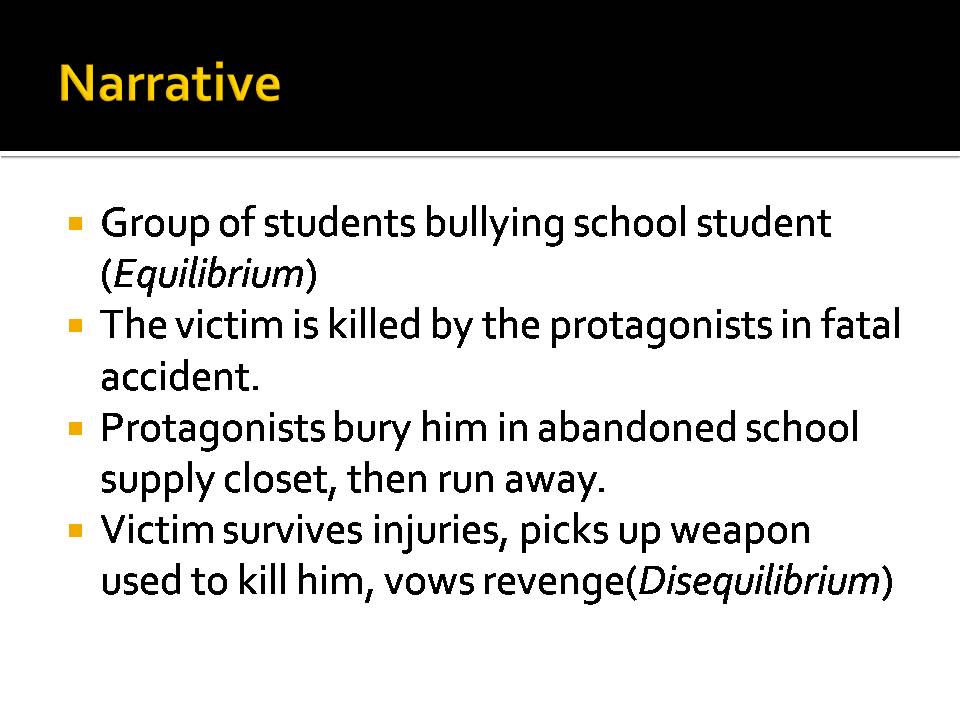
The narrative, entitled 'The Unexpected' is to clear about a victim figure whom is bullied to the point of desperation. But little do the bullies - also the protagonists - know that the victim, in revenge is planning to give them a taste of their own medicine. Only when a mysterious figure appears and people start vanishing do they realise it's too late...
I took care in producing the slides of my storyboard as I wanted to depict the diegesis of a summarised horror narrative, simple enough to establish Todorov's equilibrium as well as Propp's set of characters, but not over complicate the story by strictly adhering to Propp and Todorov's narrative theory as the trailer should preferably be minimum a minute/minute and a half.
Film trailer analysis


Monday, 5 November 2012

Thursday, 25 October 2012

Audience Feedback: Analysis

The response from my survey monkey question 'What is your favourite horror movie?' produced a varied response. A popular response was either The Saw movies, their genre specific to fans of the thriller genre, as well as Paranormal Activity, whose fans are predominately consist of mainstreamers . This told me instinctively that the target audience for my trailer is quite mixed as they find different attributions of horror films appealing. From this response, I knew that I had to use another series of questions to pinpoint the specialised answers from my target audience. This told me that for my production stage, I would have to research popular horror films to attract the audiences attention and encourage them to watch my trailer. It was clear however that whilst my target audiences were active horror viewers, their response told me they did not watch film trailers on a regular basis. Therefore, I thought that by exploring an unconventional sub-genre of social realism (specifically theme of bullying and anti-social behaviour) , it's content would help attract a target audience whom are an explorer/aspirer as well as a mainstream Psychographic, typically young student demographic groups, attracted to the narrative of horror as well as my trailers undertones of social realism. This gave me the idea to use an unconventional design during my production stage on my front cover and it's content. Henceforth, the evidence has told me that my production of my film trailer had to have content would attract a mainstream demographic
Wednesday, 10 October 2012
Location+Setting , Actors, Costumes and props


Location
 I have decided to set the location of my trailer in school as this would be most appropriate because my film is set in the scene of a school. This would also be more convenient for casting students(preferably in the 6th form) and filming after school in addition. The reason I chose to film in this area is because this is near the scene of the sixth form common room, a secluded corner of the film. This will keep up the deliberate fear of the unknown when in a blackout cut off in a corner of the school. the filming will be indoors at all times to keep up the unique selling point of the character being trapped throughout in the dark. Preferably, I would like to direct scenes for my trailer with my chosen actor/s after school as it would be best for convenience. Also, the winter term and early spring term will get quite dark after school, and this natural darkness will accelerate the scare factor for my trailer as the premise of the trailer is the protagonist and supporting actor/s are trapped in the dark.
 I have decided to set the location of my trailer in school as this would be most appropriate because my film is set in the scene of a school. This would also be more convenient for casting students(preferably in the 6th form) and filming after school in addition. The reason I chose to film in this area is because this is near the scene of the sixth form common room, a secluded corner of the film. This will keep up the deliberate fear of the unknown when in a blackout cut off in a corner of the school. the filming will be indoors at all times to keep up the unique selling point of the character being trapped throughout in the dark. Preferably, I would like to direct scenes for my trailer with my chosen actor/s after school as it would be best for convenience. Also, the winter term and early spring term will get quite dark after school, and this natural darkness will accelerate the scare factor for my trailer as the premise of the trailer is the protagonist and supporting actor/s are trapped in the dark.
Actors
The actor/s will be members of the CoLA Sixth Form. Preferably, a group of friends that would be willing to take their time out of their peer hours to take camera shots with me and let me direct them.
 Male or Female? The target audience of horror are predominantly young males. Typically the common protagonist in horror trailers is the sexually innocent female archetype, which would encourage the male mainstream to watch the trailer. However, I think it would make more of an impact to have a strong female character as the protagonist. If the protagonists is represented as less attractive and appealing but more strong and powerful, this may appeal to both genders, and women may find this more inspiring(there could relate more to strong female, link to personal identity feature of Users & Gratifications Theory). It will also appeal to the generally large group of male fans of Horror by having a strong female protagonist in the trailer who challenges the conventions of the female archetype, it may even interest more men into my trailer. Also, as the premise of the trailer is a bullied victim trapping his bullies(protagonist + group) in the dark to exact revenge, my antagonist will be male. Typically the antagonist in horror trailers in male, but i won't feature the psychical form of my antagonist in a lot of my scenes of the trailer to elevate the suspense and the classic 'unknown factor' that attracts people to watch horror trailer.

Costume
As the setting is part of a sixth form in school, the protagonist will be dressed as themselves and there won't be a distinct form of dress.This will appeal to the audience as
they can familiarise themselves with the characters in the trailer. It is important the characters don't overdress as I am trying to emphasise the characters in the trailer as everyday characters.Particularly, the antagonist in the trailer will be wearing a dark hood jacket to distinguish him from the rest of the protagonists as well as to maintain the sinister factor by not exposing his face, a typical generic conventions of protagonist in horror trailers. Examples in popular horror fiction is the Leatherface antagonist in Texas Chain Massacre Movies as well as Jason Voorhees central character in the Friday the 13th Movies.


Tuesday, 9 October 2012



Subscribe to:
Posts (Atom)