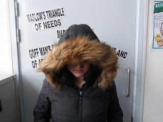
I took these photos, like the development of my Flat plan, to do a test run of what my movie poster may look like. The location, a school classroom.
This is a mid-close up shot type with natural lighting in the mise en scene. The natural lighting, coupled with the tight frame of the image makes it appealing for a horror poster as the protagonists looks isolated, and the dark focus cast from the hood jacket makes the protagonist look sinister.
In this photo, i wanted to see what the protagonist would look like from behind. Even though the fact that not seeing the protagonist face through the hood in this mid long shot can create fear from the viewers perspective, this doesn't create appeal generally as a horror poster.

This photo is much better as the natural lighting shows the outline of the protagonist's face under her hood jacket, not enough in the tight frame to stop the fear from her unidentified face, just enough to make the protagonist look illusory and menacing.
Additionally, this is space at the top for
This photo similarly has an appeal because of the head space for the title. The lighting is in much more excess then the other images. If there was a little dark focus in the mise en scene, it would make the image look more scary, appealing more to a target audience.
This final photo, although taken from a high angle to make the protagonist look more threatening, the fact that you can't see the character face at all makes the image look unattractive for a potential horror movie poster. The isolated, menacing effect of the tight frame is the only generic representation of horror in this image.
Overall, the mid close up images in a tight frame i have decided would be the most appealing to a target audience for the development of my horror movie poster. This is because the protagonist face is partially seen in good quality with the natural lighting of the picture. However, in my production stage i will be weary of the use of too much lighting in one image as a dark mise en scene is more conventional and attracts general appeal in a horror film poster. I will use a different hood jacket costume for the protagonist as the hood jacket in these series of image was quite constricting because of the fur lined top that prevents the audience from seeing her face at all, which whilst the unknown factor of her unidentified face may generate appeal for a horror poster, this is likely to not attract the mainstreamer psychographic appeal of my target audience.


No comments:
Post a Comment