1st Draft Film Poster
 As a first draft of my film poster, i was impressed with my initial product. The masthead positioned at the top of my poster is eye catching in a deep crimson colour. The typography incidentally resembles the colour of blood, a tool used common generic representation of horror posters. Additionally, I used the blur tool on Photoshop to make the writing look like it was running down the canvas. This would make the iconic imagery of blood look even more present and attract the target audience to the poster. Furthermore, the slogan "School's Out. Forever" was a clever play on the Alice Cooper 1972 hit. This slogan also pointed out the possible setting of said film, suggested further by an image of a unknown figure in a hood jacket, which encourages a sinister edge to the poster.
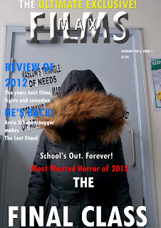
1st Draft Magazine Front Cover
 In the development of my first magazine front cover draft, i have realised that the main image is too similar to the my poster and would be better suited for my horror poster. When advertising horror films on a magazine front cover, there tends to be either a close up or mid close up shot of either the protagonist or antagonist or both in some instances. This generic convention of magazine front covers is more likely to attract my target audience towards my magazine front cover. Additionally, the background colour in the mise en scene of my front cover is too bright from natural lighting. and as a result will not evoke a sinister image to audiences that is associated with the generic representation of horror. The lighting also pulls focus away from the masthead positioned at the top of the page, and the subheadings on either side of the page. The subheadings looks overlapped in a scruffy fashion and this consequently demotes the illusion that this magazine front cover is anything like the generic representation of the film magazine
Although, the tight frame of the main image does, to some extent, keep up the feeling of isolation and looks a bit threatening by casting a shadow in the mise en scene.
2nd draft on Photoshop
 The background colour the front cover in purple does not evoke any kind of fear or horror associated with this. The background colour in the mise en scene needs to be black or red, a colour scheme generically represented by horror. The font, particularly in the subheading, does not particularly have any difference to the masthead. I need to find two or three different fonts to use for the subheadings in order to make the page look distinct and striking to the naked eye of my target audience. The subheading on the right is in too much length my market research into magazine covers has shown that less is more when it comes to the designs of magazine front covers.
No comments:
Post a Comment